Convenience to the core
ZIPCAR BRAND REFINEMENT + EVOLUTION
THE OPPORTUNITY:
Elevate Zipcar’s brand so it feels meaningful and consistent—not just visually, but emotionally—around a clear north star of convenience.
THE THINKING:
Over time, Zipcar stopped feeling like one thing. It had just started to drift—different partners, multiple messages, varied interpretations. Our job wasn't to reinvent it. It was to bring everything back into alignment around convenience. That meant starting at the core and building outward from there.
OUR GUT CHECK:
“Does this feel easy?”
MY ROLE:
I shaped this from strategy through execution—facilitating the workshops that surfaced what needed to change, building a phased rollout plan so we could evolve without stopping day-to-day work, and holding the creative bar across every workstream. Direct collaborations included a verbal consultant on tone, the UX team on an accessibility-first font update, and internal and external partners on guidelines built to actually stick.
WHAT WE DID:
We started with the archetype. Shifting from "everyperson outlaw" to "innocent creator" gave us a clearer strategic foundation—more optimistic, more focused on ease. But archetypes can stay abstract if you let them. So we took it one step further.
From there, we worked through voice, color, layout, motion, and iconography—not as separate work streams, but as one connected system all pointed at the same question: does this feel easy?
The sections below show how that played out in practice.
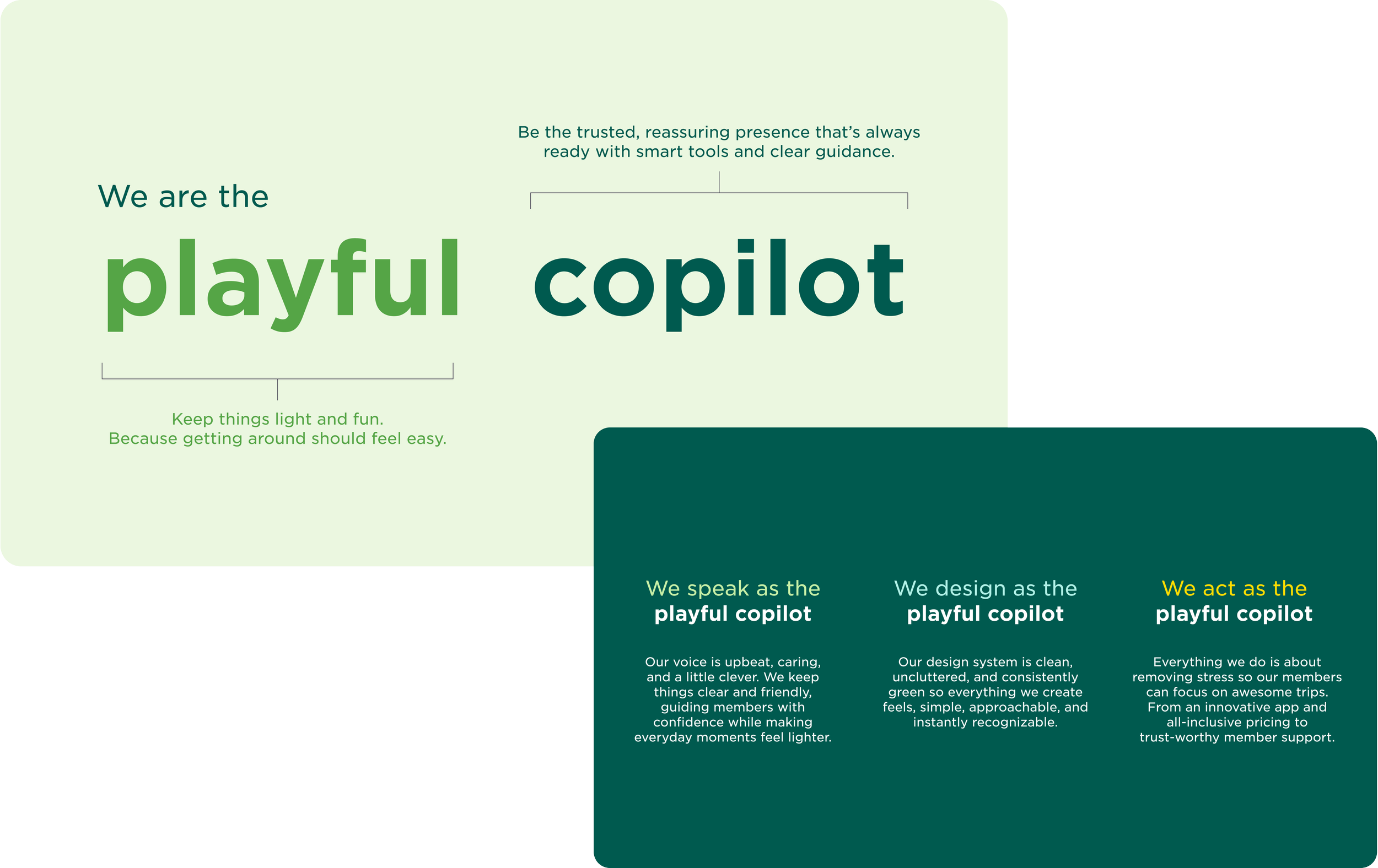
Personality adjustment
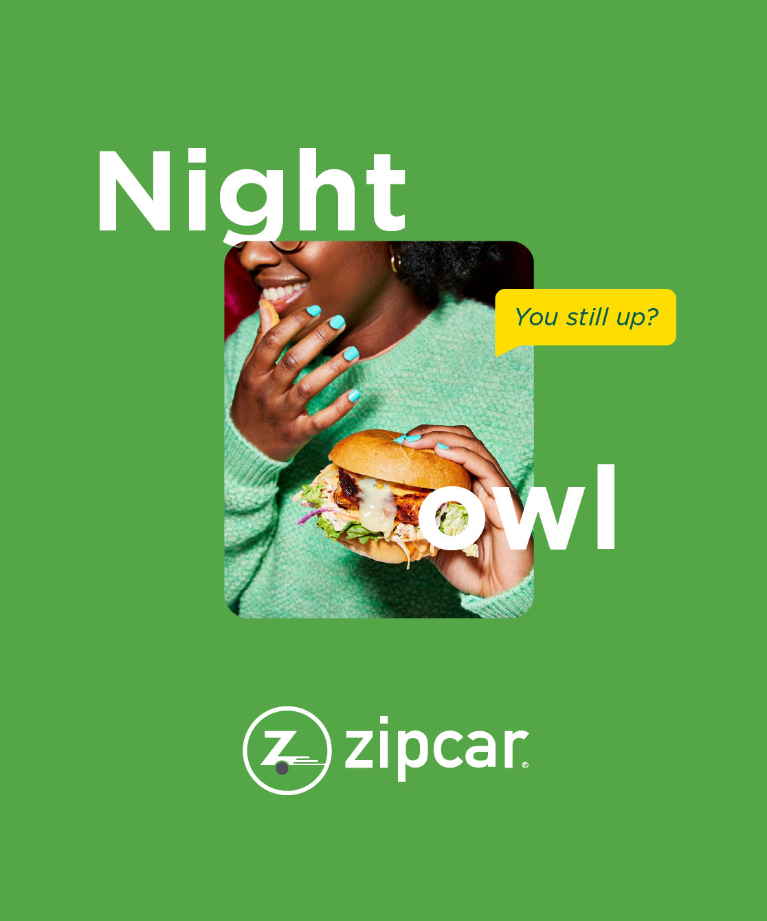
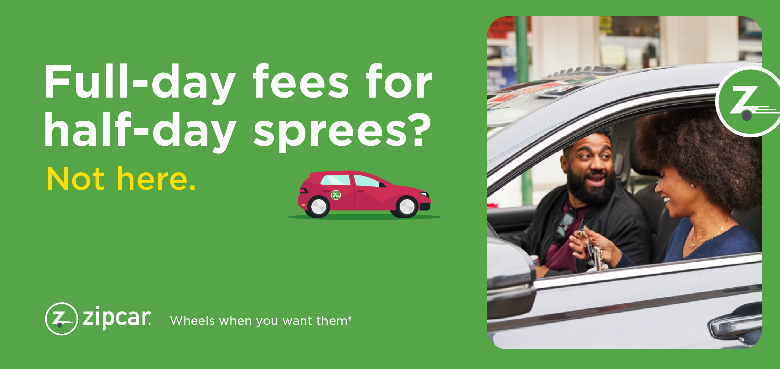
To make the archetype practical and less abstract, we translated it into something teams could actually use: Playful Copilot. Same DNA as the Innocent Creator but grounding Zipcar in a human, familiar character. It gave teams a shared point of view to make decisions from, push back on work that drifted, and set the tone for everything that followed.
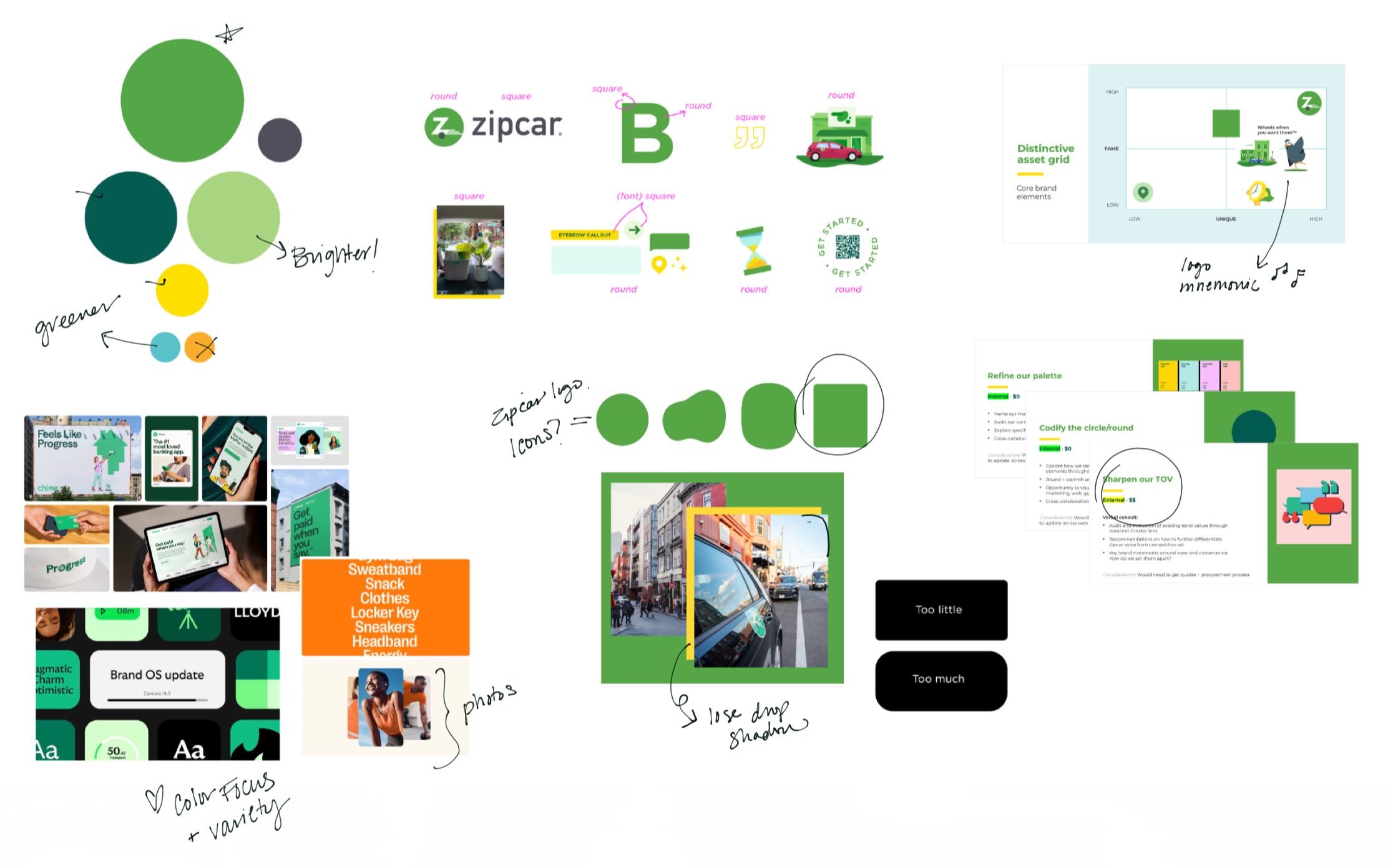
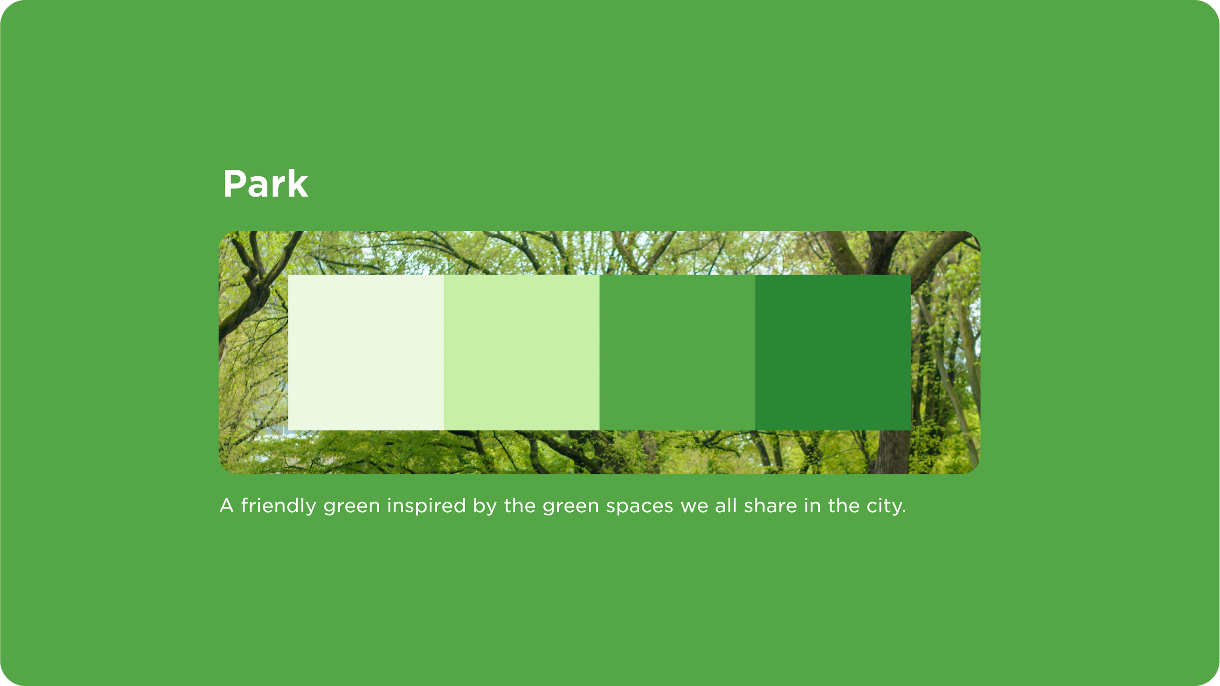
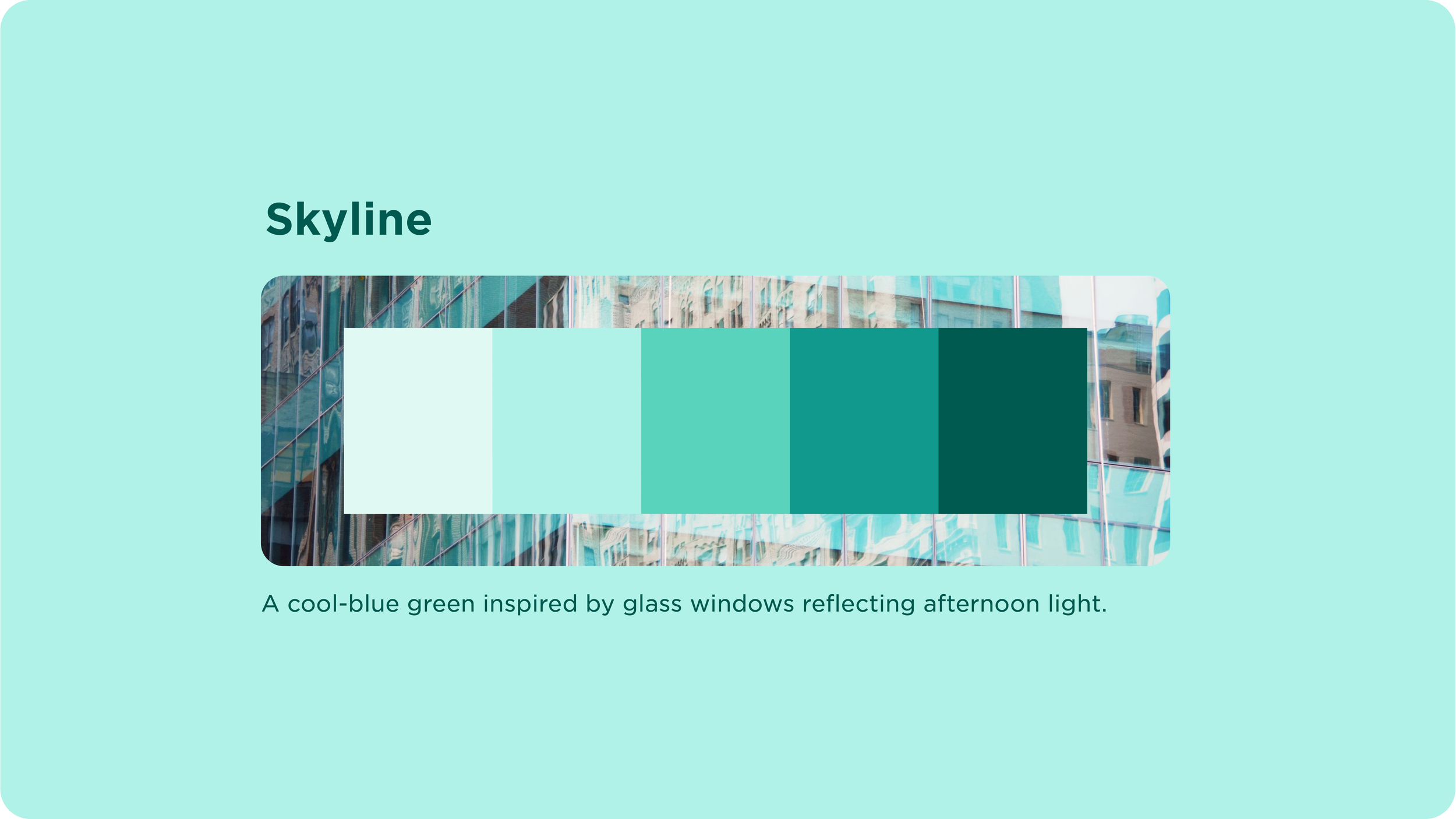
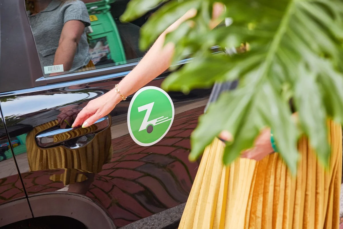
Color focus
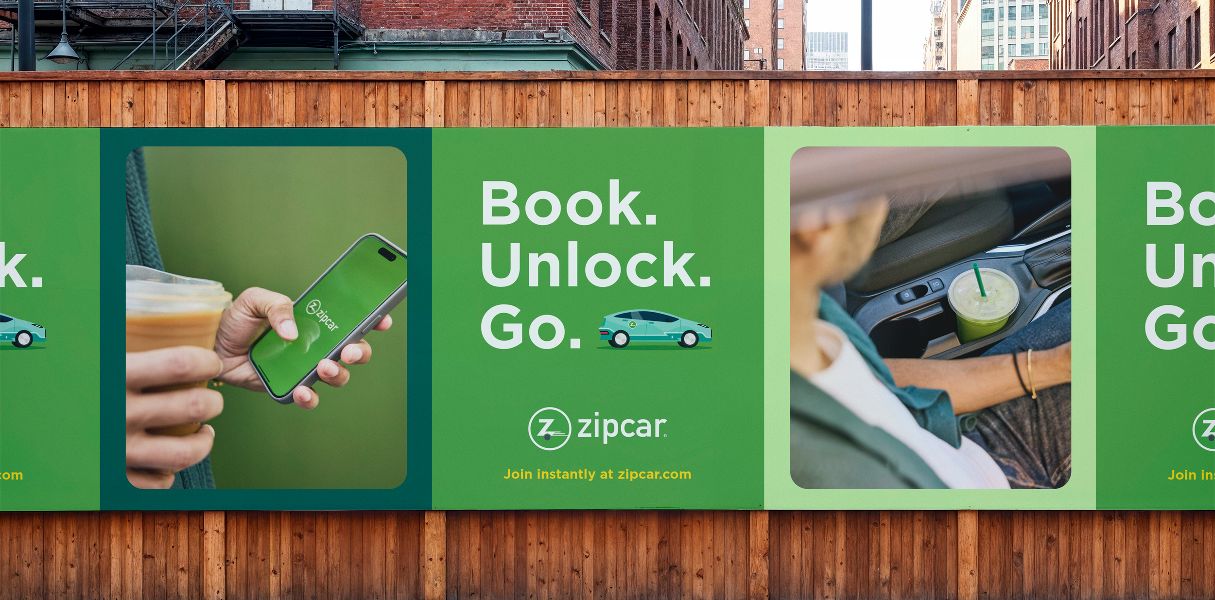
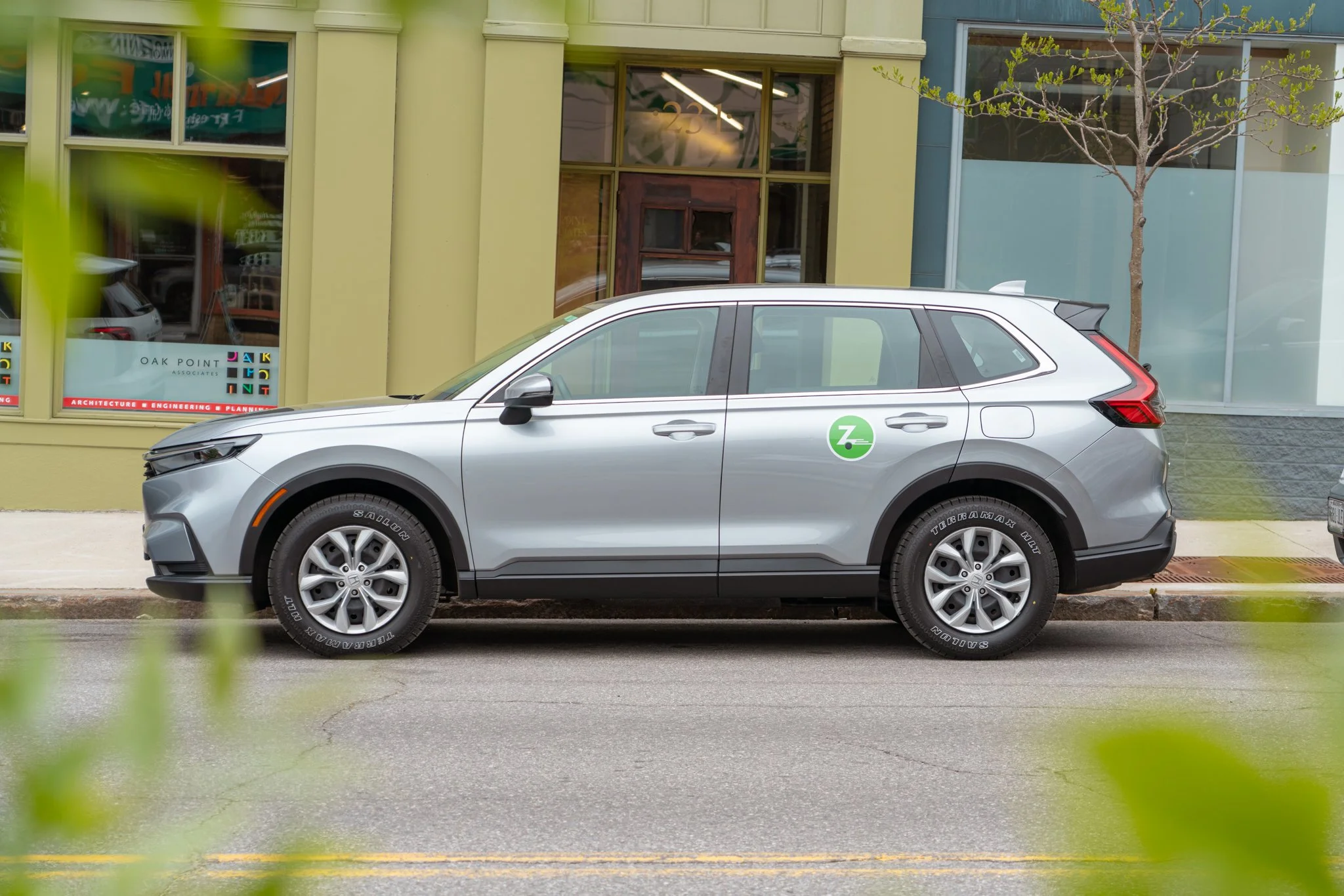
Zipcar’s green is one of our strongest brand signals. We refined the palette to feel more intentional and usable, keeping everything grounded in green so it stays cohesive. That thinking carried into our photoshoots, where we subtly worked green into props and wardrobe so it showed up naturally in lifestyle imagery.
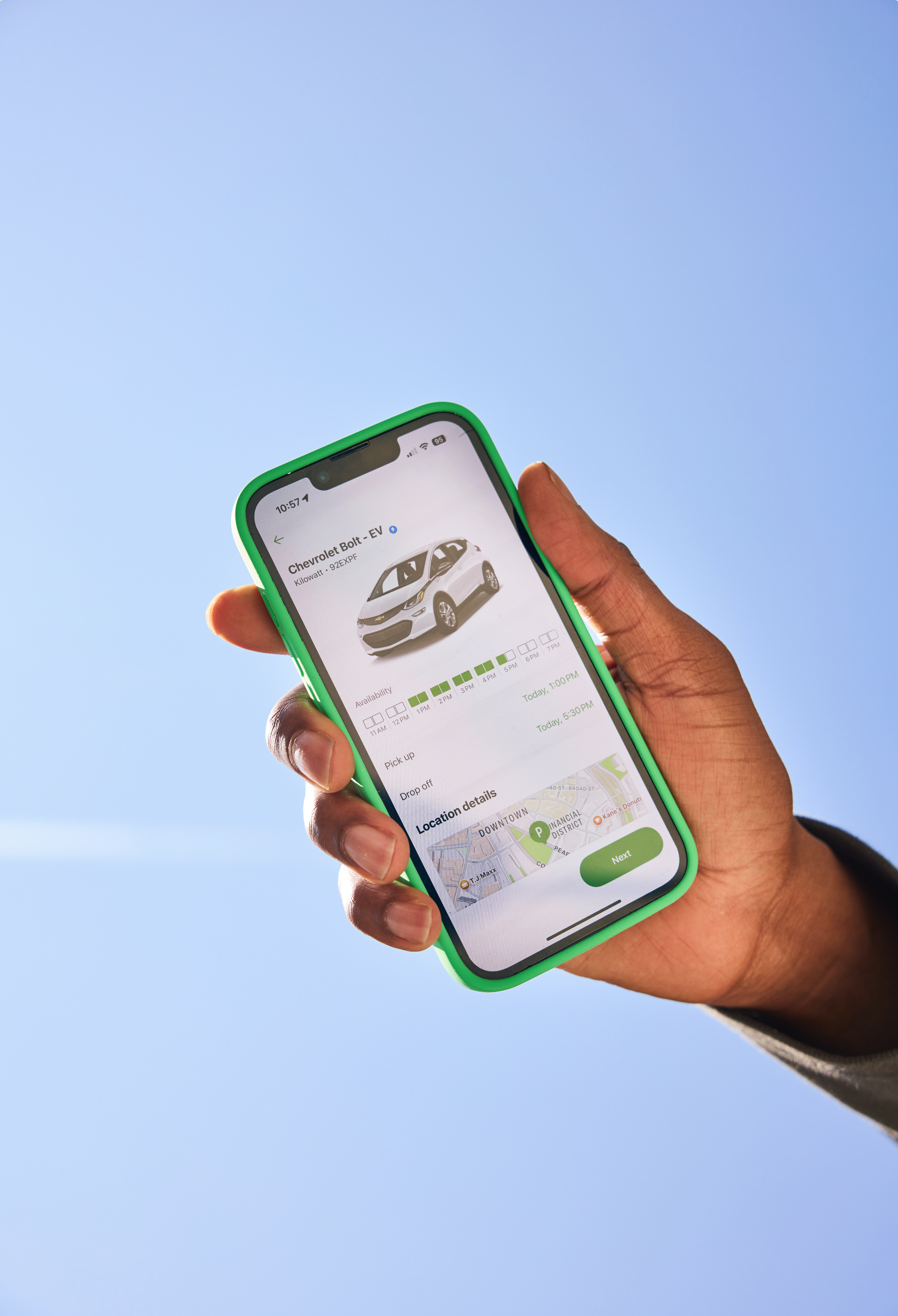
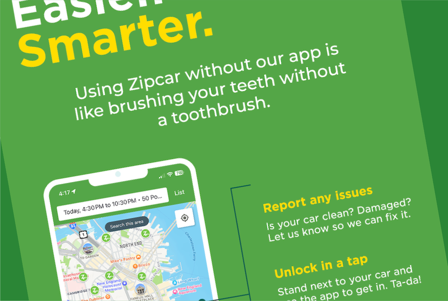
Designing for ease
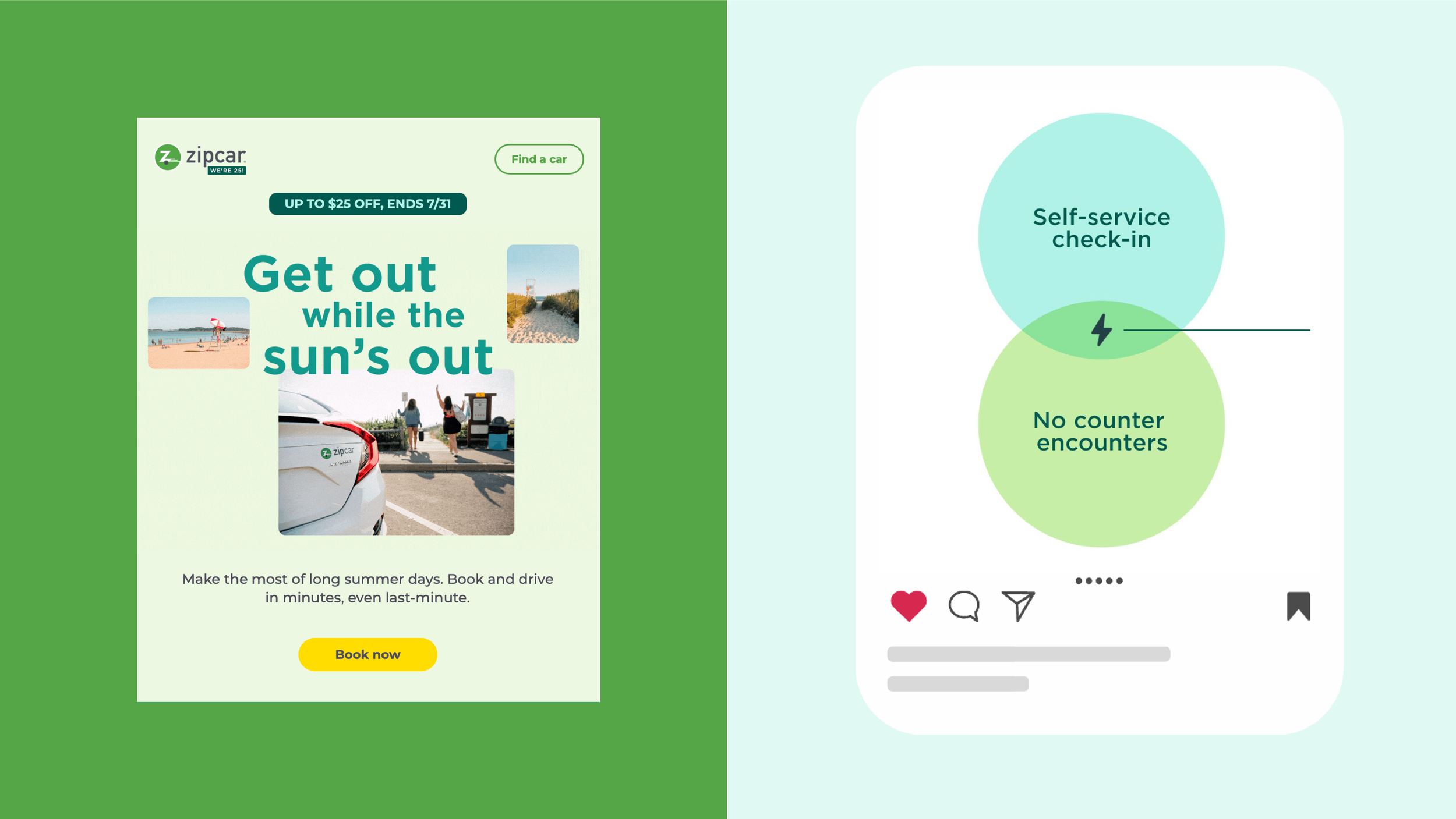
Visually, convenience means clarity. The work shouldn't compete with the message—it should disappear into it.
LAYOUT + DESIGN:
We keep layouts simple and focused, highlighting what matters without extra clutter. Soft, rounded corners, breaking information into steps and plenty of white space make everything feel approachable and easy.
MOTION:
Our motion is quick and fluid, mirroring how easy Zipcar is to use. We rely on simple, snappy transitions to bring energy to the brand without overdoing it. Animation should always feel helpful, never distracting.

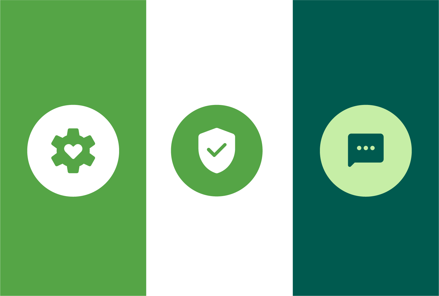
ICONOGRAPHY:
Icons simplify ideas fast. Our system stays clean and consistent, with circular shapes that tie back to the logo. It was built to be easy for teams to expand as new needs arise.
THE IMPACT:
Ready to go
The guidelines are live and in the hands of internal teams and external partners. That's the real test—not whether the work looks good in a deck, but whether people actually use it to make decisions.
The brand personality shifted too. "Playful co-pilot" replaced a vaguer archetype and gave everyone a clearer lens. Now when a project kicks off, that's the first question: does this feel like a playful co-pilot? It's become shorthand for the whole brand—which is usually how you know a system has actually taken hold.